Friday's Job Report: Ugly and Uglier

Here's the Big Picture with a WSJ chart on the 'Jobs Recovery' since President Obama took office:
Barry goes on to explain that the jobs report is the 'most overrated economic data point of the month.' Though true, it nevertheless swings the markets and has an impact on investors and the political class in Washington.
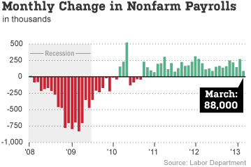
The initial report, which shows an economy that only added 88,000 jobs in March, is nearly a drop of 200,000 jobs from February. Retail got hammered. Was it because of the sequester? Probably not, says Annie Lowery. Definitely not, says Sudeep Reddy. The cuts, though, might dampen job growth in the coming months as they are phased in by various government agencies. The most likely culprit is the expiration of the payroll tax cut, says Joe Weisenthal. Advocating for its reinstallment, Joe points out that retail has been slammed since the beginning of the year. Less money in my pocket is less money in a store owner's. And, of course, Joe is Joe so he posits the report was actually good!
Take a look at how the payroll tax cut slashed worker's take-home pay with this handy-dandy calculator. Quick take: a worker making 40k a year will lose $800 this year alone, a decrease of 2.3%
Austan Goolsbee says the report is a 'punch to the gut.'
Economists say: Unambiguously weak
As expected, investors sold stocks, bought bonds, dumped the dollar and gobbled up gold. via @Qz and @MatthewPhillips
Jon Hilsenrath notes that talk of the Fed ending its bond-buying program might have been 'premature.' QE cessation is basically off the table for the rest of 2013.
The report, according to Neil Irwin, proves that the economy just isn't as strong as we thought it was.
Todd Sullivan says some 'funky stuff' is going on with this jobs report.
@Mctaguej says, "Some weird #s in BLS jobs report indicate sampling problems and probable restatements.'
7 great charts from the guys and girls over at Wonkblog
The most colorful chart you'll see today on jobs, from BusinessWeek:

Matt Philips (one L) reminds us to be wary of all the euphoria going around about a >3% GDP number for Q1. A jobs # like the one we saw today might just be the cold shower we very much needed.
Rick Santelli and Jim Bianco, mythbusting.
The most distressing number: 63.3%. That's the Labor Force Participation Rate (LFPR), the lowest since Jimmy Carter. Sam Ro says the population dynamics are changing--we are just getting older. In fact, the LFPR for seniors is increasing while the key 25-54 demo is falling, and has been falling for some time. Or maybe it's just that employers can't find the right employees. That's what Heidi Golledge thinks. Don't forget a whole host of other reasons, via US News, that the participation rate is going down: women entering the workforce is plateauing, fewer teenagers are working, more people are on disability and manufacturing jobs--those jobs most likely to be done by 25-54 year olds--are vanishing. And unemployment benefits are drying up all over the country, pushing people out of the job market completely. All this proves that the 7.6% unemployment rate is a bogus measure of the economy's health.
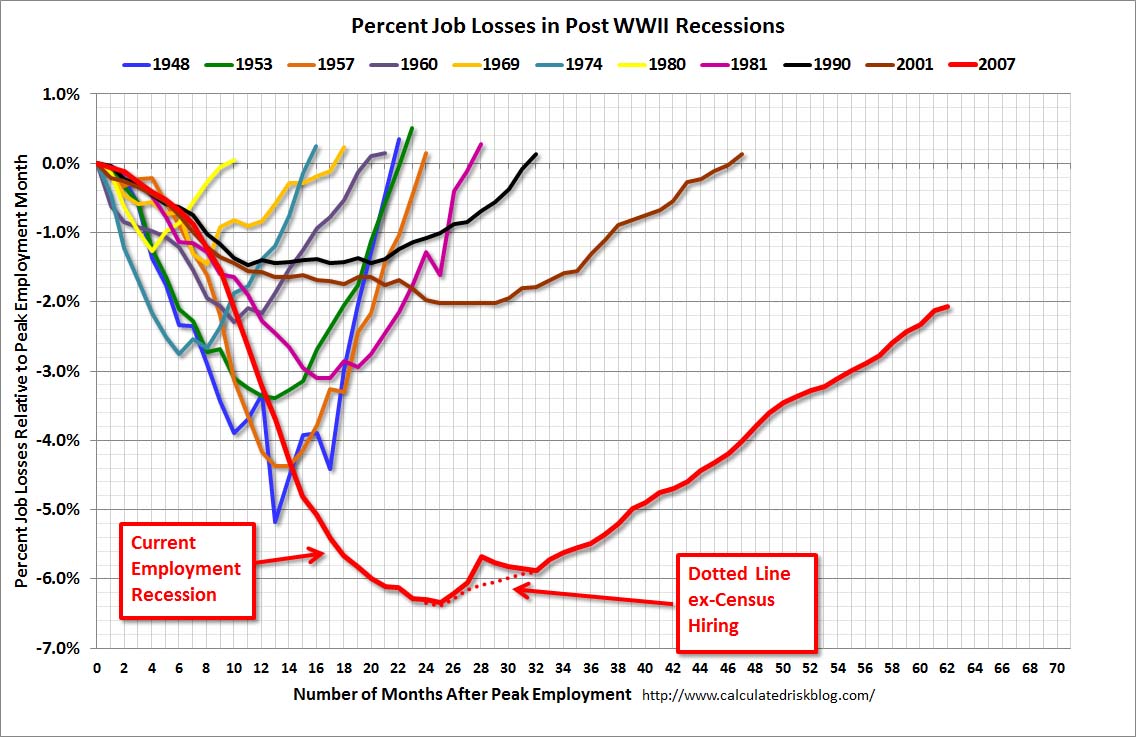
And perhaps the most distressing chart, courtesy of the venerable Calculated Risk, shows this jobless recovery with respect to past recessions. Not good at all.